Stephanie Belon
Graphic Design

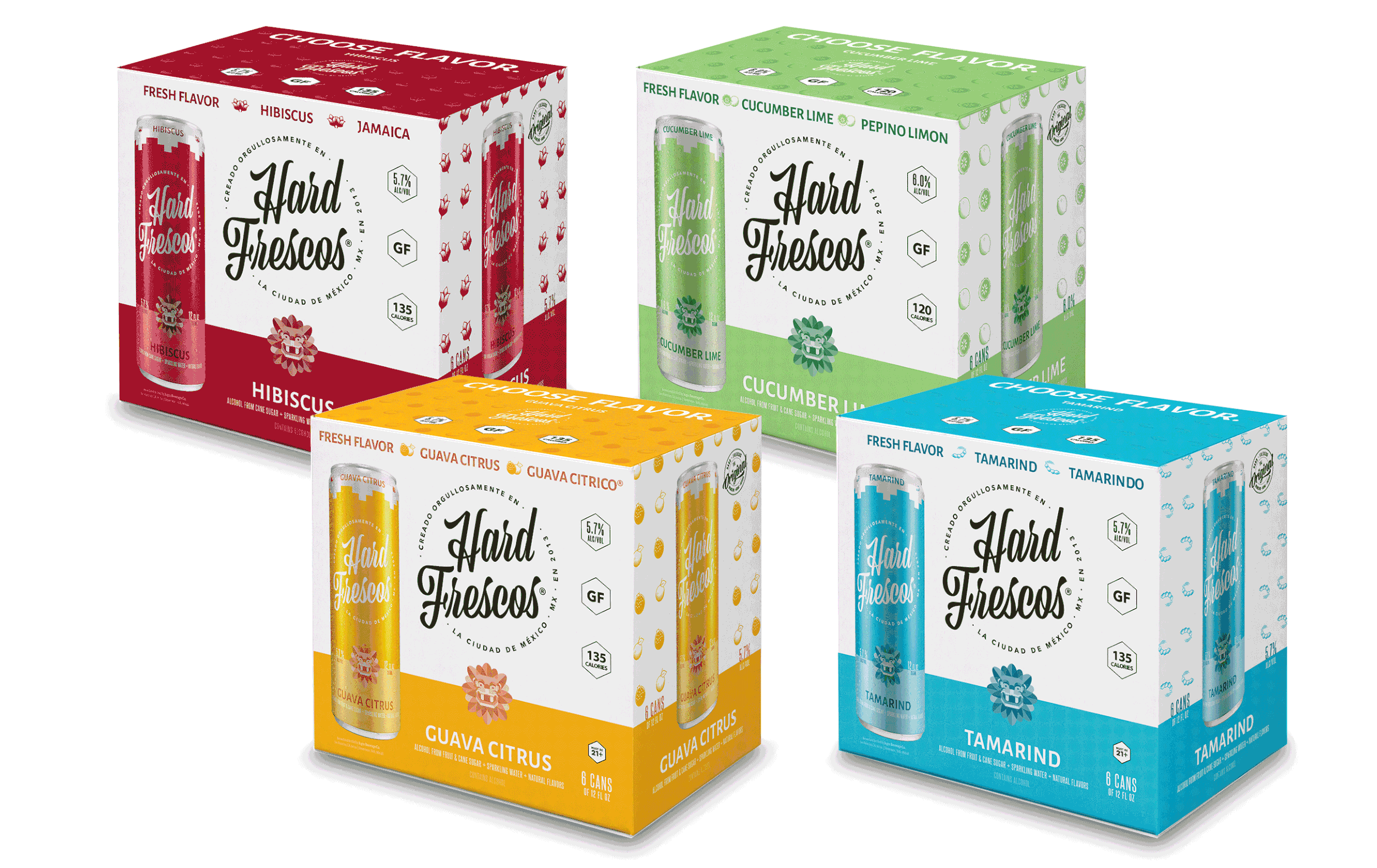


Hard Frescos is a very fun brand that gives a boozy twist to the classic Mexican aqua fresca. I was asked to redesign the current packaging to reflect the bright and energetic personality of the brand. When discussing the packaging, the client asked that I do the background another color besides white so it would stand out in the current seltzer category, so the light blue was landed upon. I also thought it was important to include some fruit references, since many American consumers may not be familiar with some of the unique flavors Hard Frescos offers.
Below are various pieces I created for the Hard Frescos brand, along with the new packaging I created.