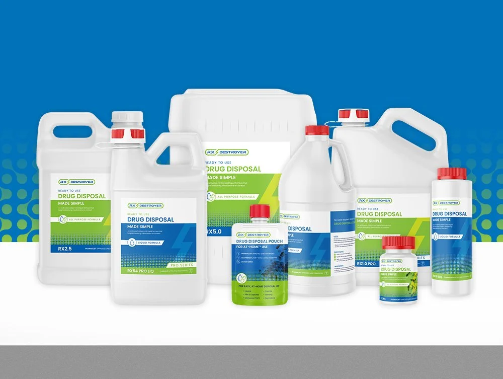
Rx Destroyer had grown up. The products expanded, the distribution grew, the company was acquired, but the brand hadn’t fully caught up. I led the rebrand to modernize the identity while keeping the equity people already trusted.
Rx Destroyer *
Rx Destroyer *
The challenge
Pharmaceutical disposal is not known for being visually exciting. It’s compliance-heavy, muted, and very blue. Rx Destroyer already had strong recognition, but the identity didn’t reflect the confidence or innovation behind the product.
The question wasn’t “How do we redesign this?” It was “How do we make this impossible to ignore, without losing who we are?”
My role
I led the creative strategy and execution from logo redesign through packaging, rollout planning, and cross-functional implementation.
strategy & Design
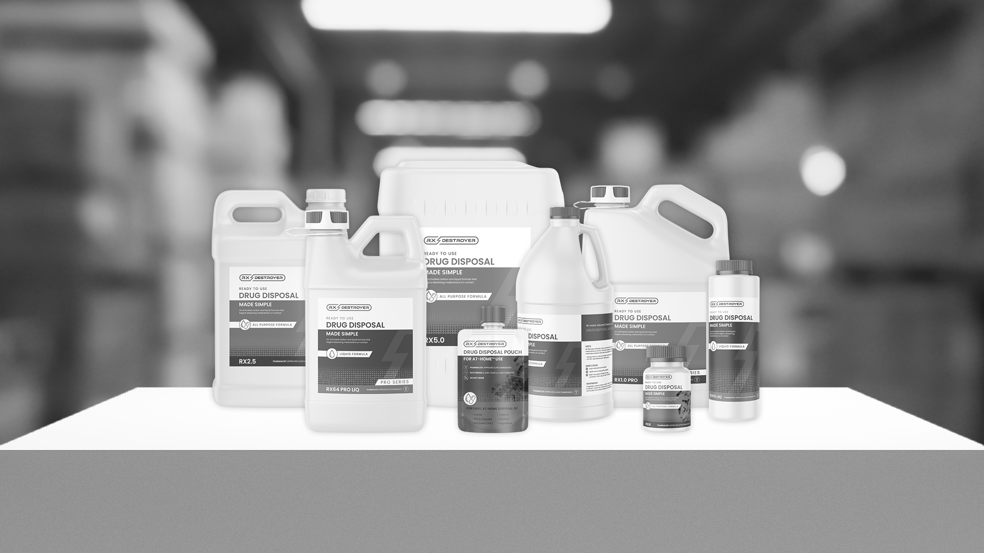
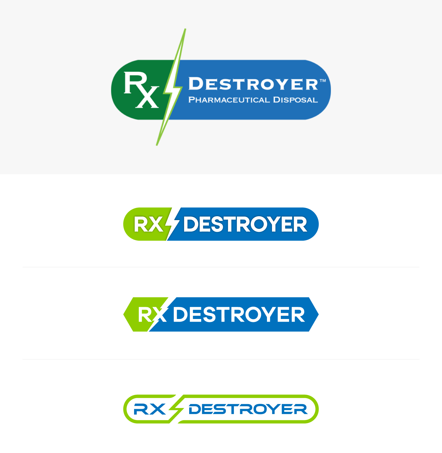
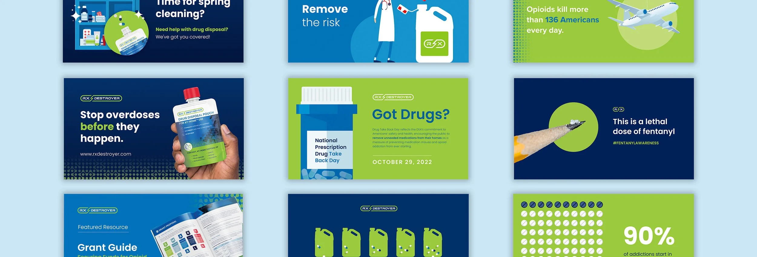
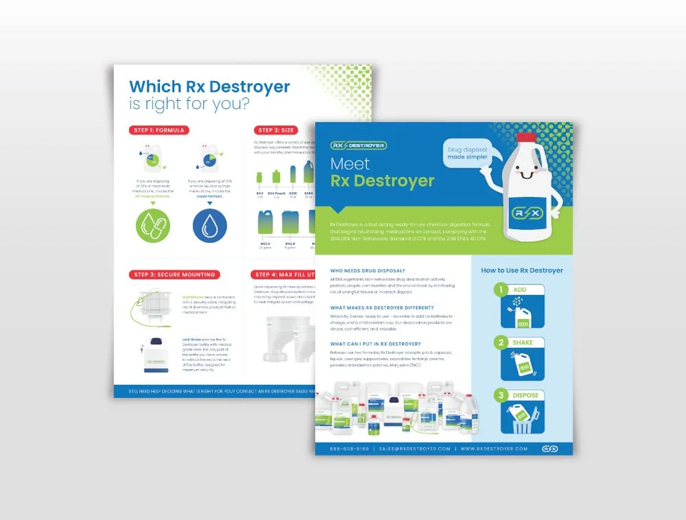
We didn’t throw everything out. The lightning bolt and pill silhouette were part of the brand’s DNA, but we refined and modernized them instead of reinventing them.
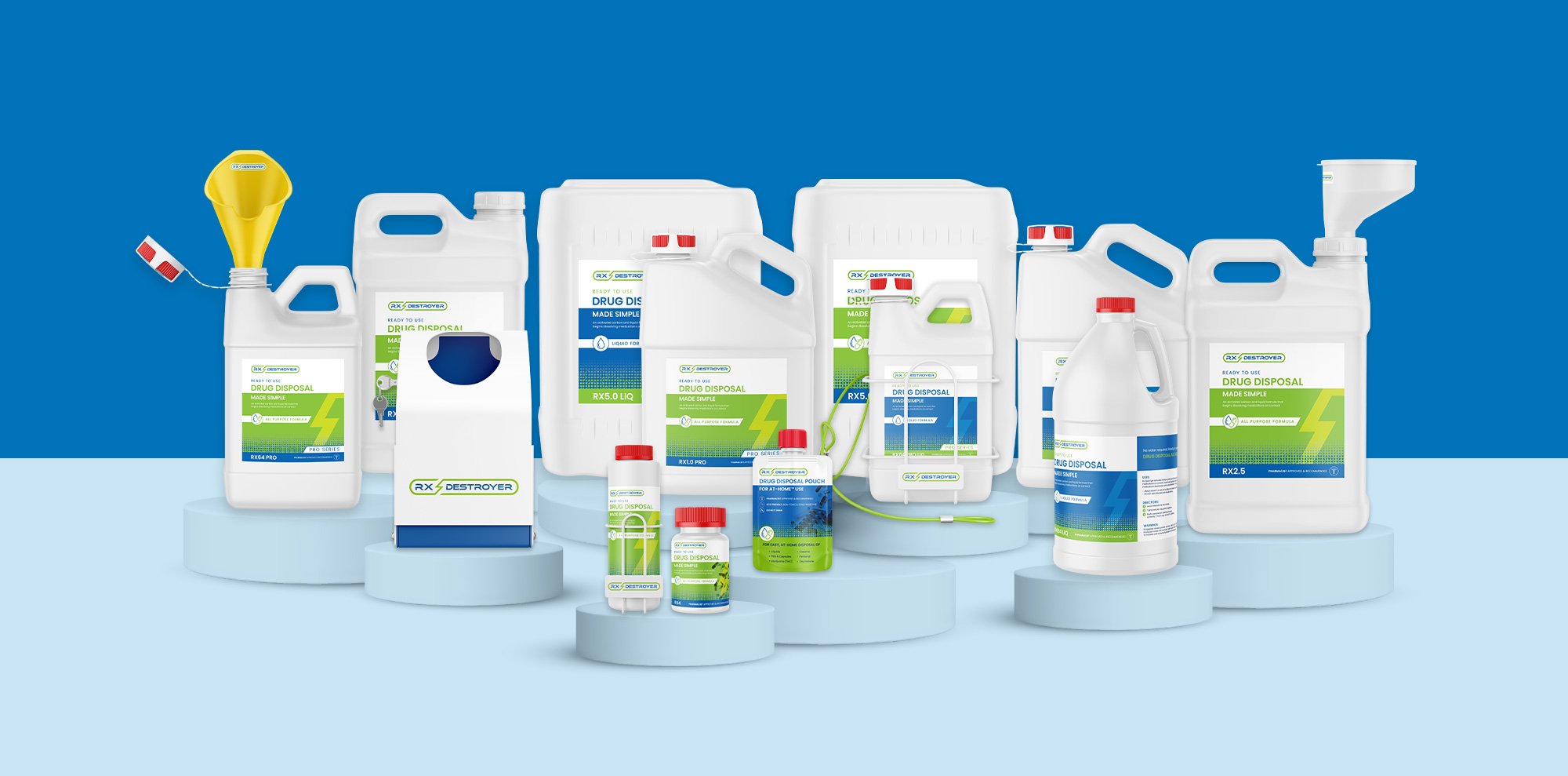
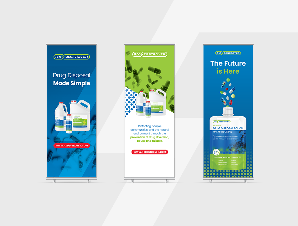
We amplified the color palette to increase shelf visibility and stand out in distributor catalogs and on trade show floors. We introduced a graphic dot system inspired by the deactivation technology itself, giving the brand a distinctive, ownable visual language.
Packaging hierarchy was simplified so the products felt easier to navigate in real-world clinical environments. Every decision laddered back to visibility, clarity, and authority.
the result

the impact
*
the impact *
The brand immediately stood out at trade shows (and yes, people noticed). Internally, the rebrand unified teams and repositioned Rx Destroyer as a bold, tech-forward leader in the space.
-
![]()
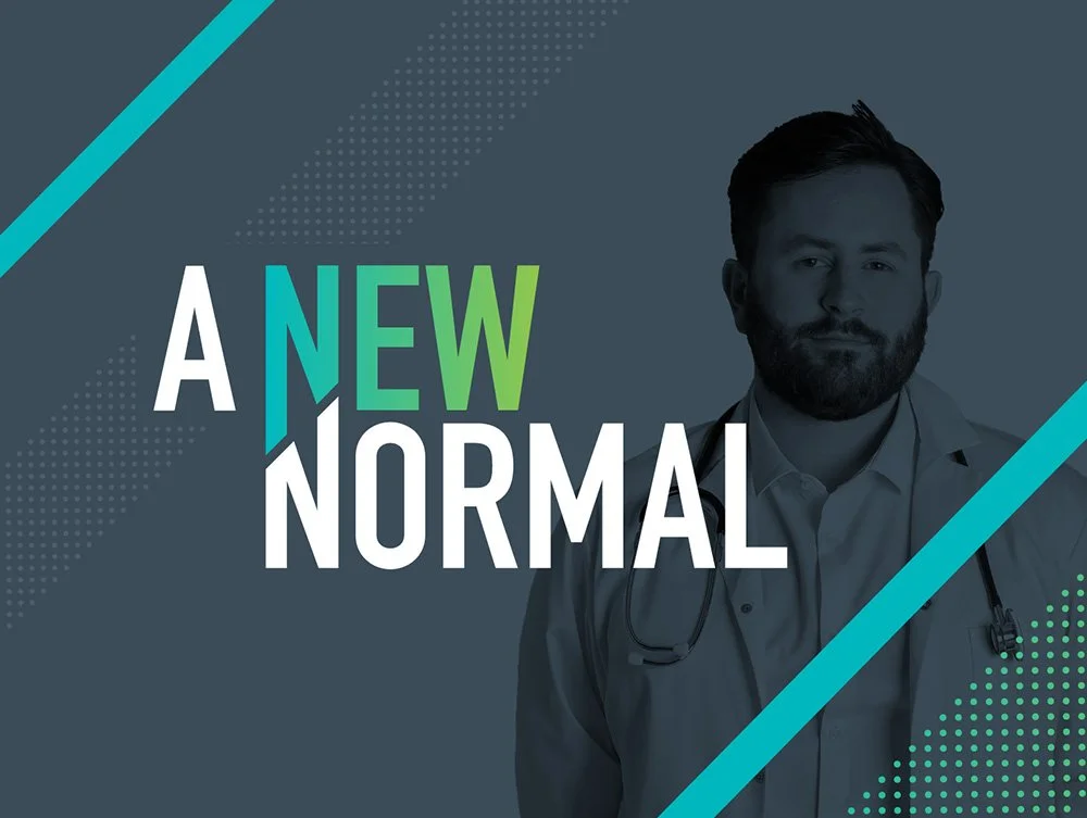
A new normal
BRAND DESIGN, CAMPAIGN DEVELOPMENT
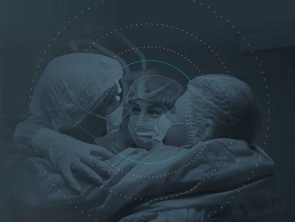
Launched during the height of COVID, New Normal positioned Daniels Health as a steady, mission-critical partner to hospitals navigating chaos. -
![]()
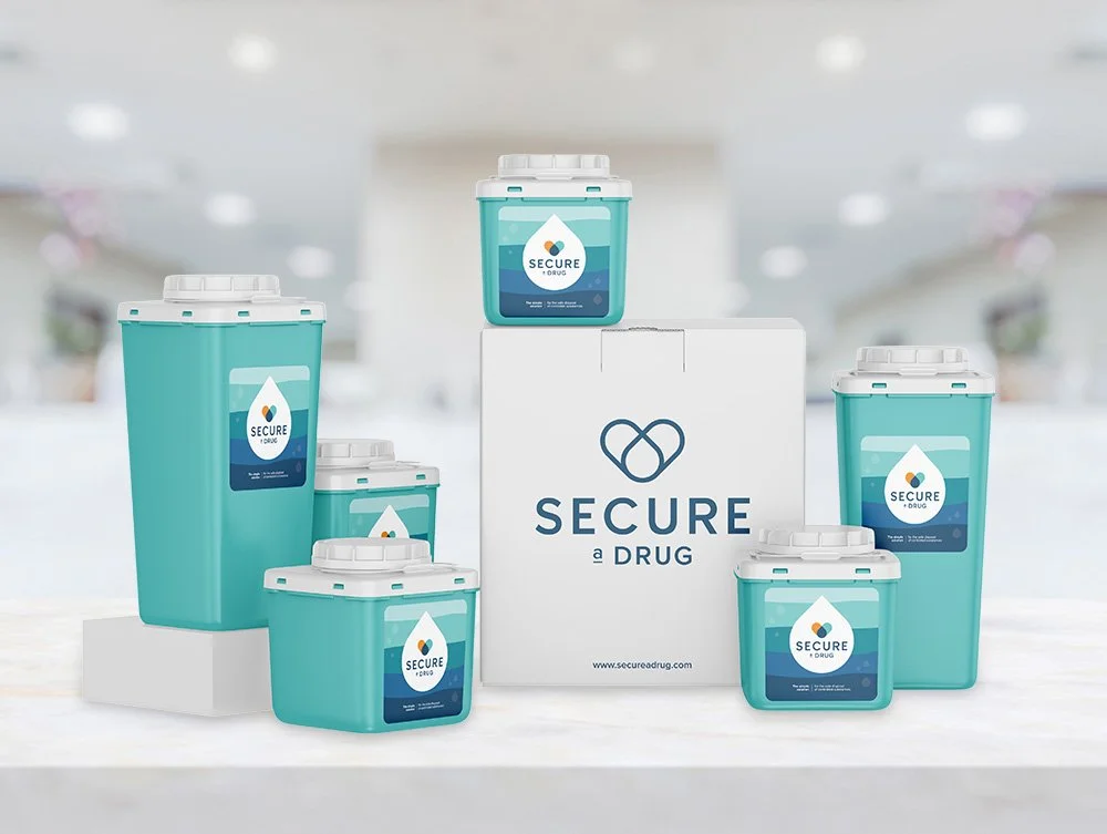
Secure a drug
BRAND DESIGN
This project started with an externally developed logo and turned into a full-scale brand build-out for a specialized drug diversion prevention solution. -
![]()
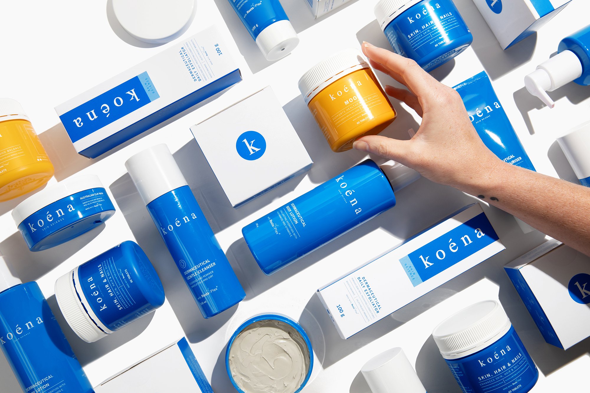
Koena
PACKAGING DESIGN
Koena is a clinically driven skincare brand built around a proprietary anti-inflammatory blend called Resta-Plex. The science was strong. The packaging… needed help.
-
![]()
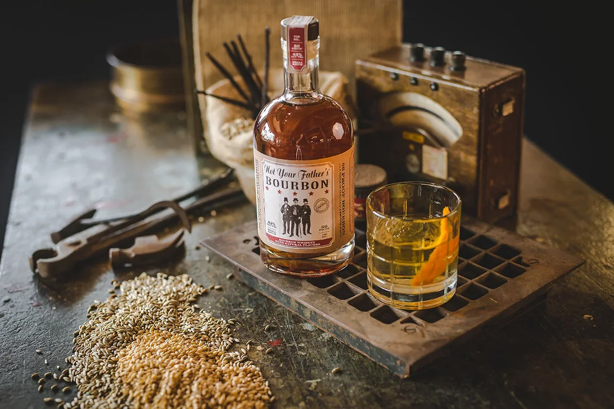
Phusion Projects
BRAND DESIGN
Built and scaled alcohol brands end-to-end, owning identity, packaging, socials, and activations as part of a two-person creative team.
-
![]()
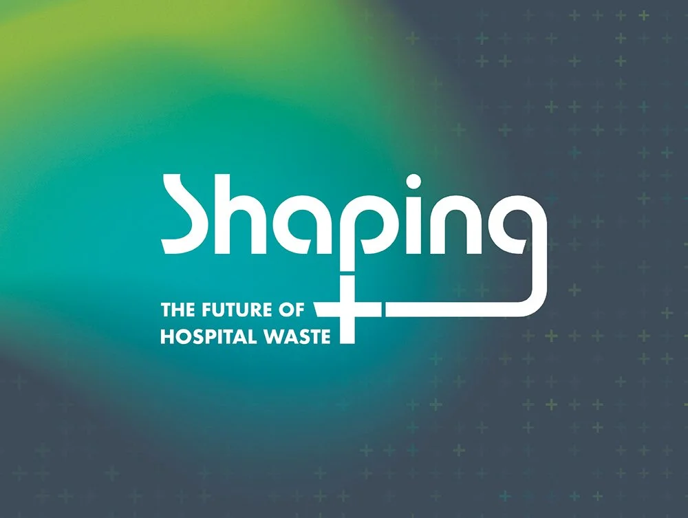
Shaping the future of hospital waste
BRAND DESIGN, CAMPAIGN DEVELOPMENT
Daniels is often perceived as a sharps company. In reality, it offers a full-suite hospital waste solution. This campaign was about correcting that perception globally.
-
![]()
Rx Destroyer
BRAND DESIGN
Rx Destroyer had grown up. The products expanded, the distribution grew, the company was acquired, but the brand hadn’t fully caught up.
-
![]()
Healthcare uninterrupted
CAMPAIGN DEVELOPMENT
This campaign tackled one of the biggest barriers in healthcare: fear of change. We positioned Daniels Health as the partner who makes vendor transition seamless, not scary. -
![]()
Internal summit branding
BRAND DESIGN
Over several years, I developed logo identities for internal summits and leadership events. Some required full mini brand systems. Others primarily lived on swag (which, let’s be honest, is often what people remember most).
-
![]()
Let Your data go to waste
CAMPAIGN DEVELOPMENT
This campaign promoted Daniels’ proprietary location-level data tracking with one goal: drive demo requests.