Secure a drug *
Secure a drug *
This project started with an externally developed logo and turned into a full-scale brand build-out for a specialized drug diversion prevention solution. My job was to take that foundational mark and turn it into something cohesive, differentiated, and actually memorable in a category that… wasn’t.
The challenge
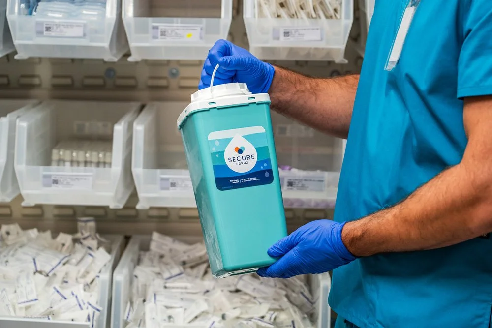
The drug diversion space is heavily regulated…and it shows. Most competitors lean into sterile, compliance-first branding that feels institutional and cold. The problem is, drug diversion isn’t just an operational issue. It impacts caregivers, patients, and entire communities.
We had an opportunity to build something that felt credible without feeling clinical for the sake of it. Something that could live comfortably in a hospital setting but still feel human.
My role
I partnered with and helped manage the external agency during logo development, then took the reins to expand it into a scalable brand system across marketing, sales, and digital.
strategy & Design
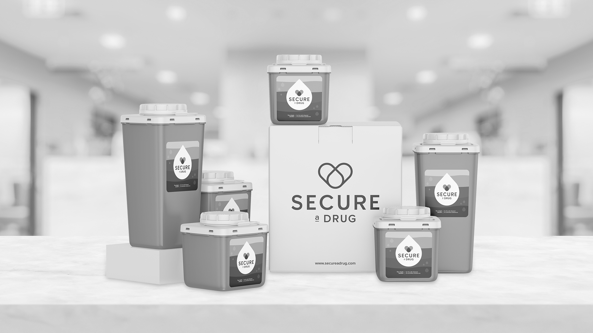
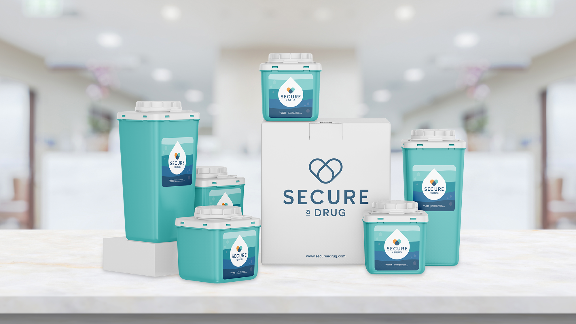
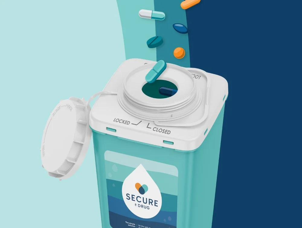
The category demanded professionalism, but we saw space for warmth. The product’s water-based functionality became our conceptual anchor. I extended the wave and droplet forms into a flexible visual system that created cohesion without feeling repetitive.
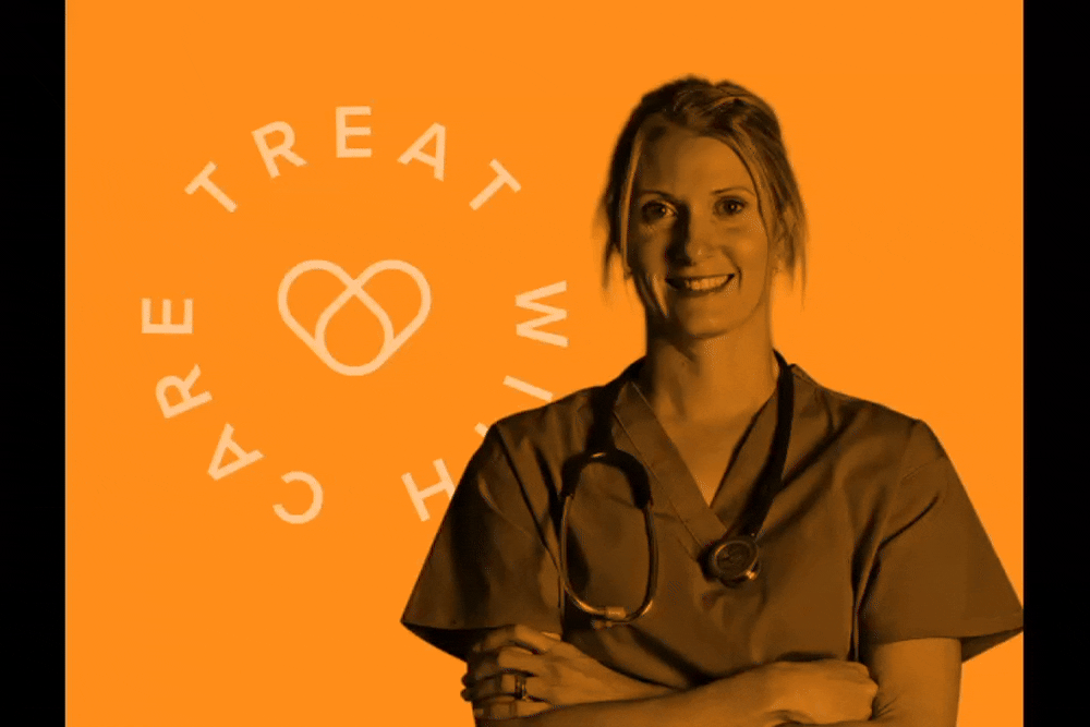
We also introduced the “Treat with Care” emblem, which is a subtle but intentional reminder that this product exists because people are affected. The goal wasn’t to soften the science, but to add humanity to it.
The final system balances fluidity and structure. It’s empathetic but grounded, modern but responsible.
the result

the impact
*
the impact *
The brand launched successfully across markets and gave internal teams a clear, unified identity to rally around. This resulted in growth over 675% since it's first year of sales, going from $116k - $900k in just 3 years. In the last year, with targeted custom marketing and education support, there was an 80% YOY growth.
-
![]()
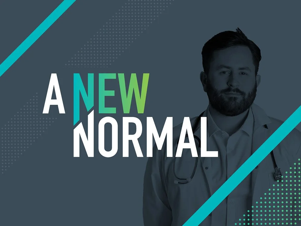
A new normal
BRAND DESIGN, CAMPAIGN DEVELOPMENT
Launched during the height of COVID, New Normal positioned Daniels Health as a steady, mission-critical partner to hospitals navigating chaos. -
![]()
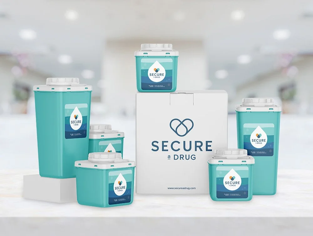
Secure a drug
BRAND DESIGN
This project started with an externally developed logo and turned into a full-scale brand build-out for a specialized drug diversion prevention solution. -
![]()
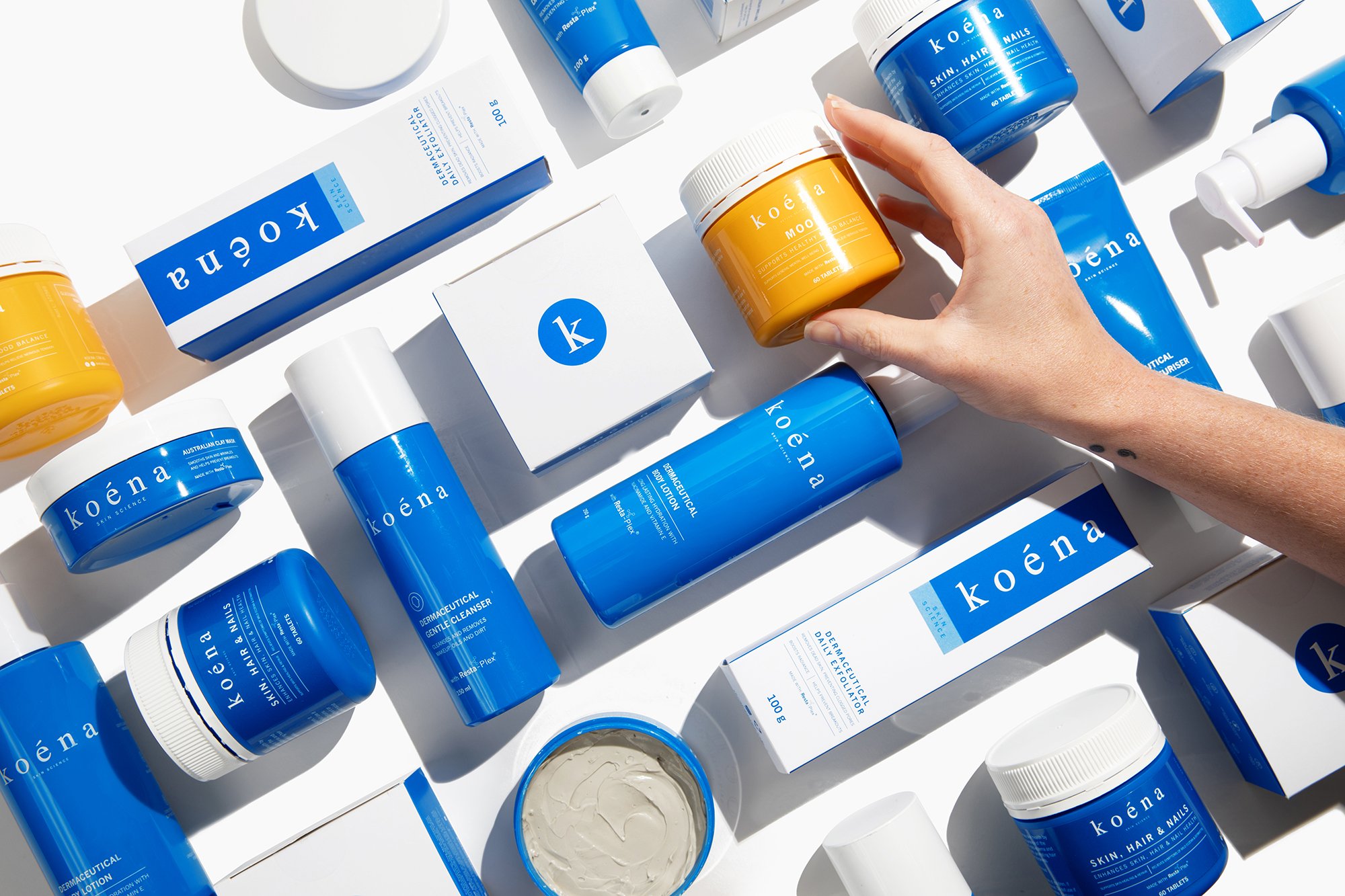
Koena
PACKAGING DESIGN
Koena is a clinically driven skincare brand built around a proprietary anti-inflammatory blend called Resta-Plex. The science was strong. The packaging… needed help.
-
![]()
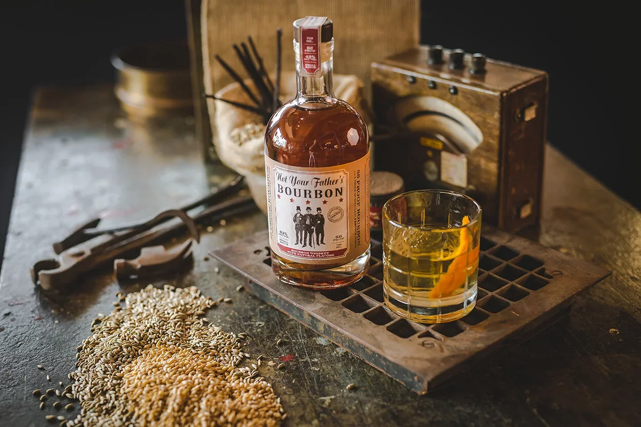
Phusion Projects
BRAND DESIGN
Built and scaled alcohol brands end-to-end, owning identity, packaging, socials, and activations as part of a two-person creative team.
-
![]()
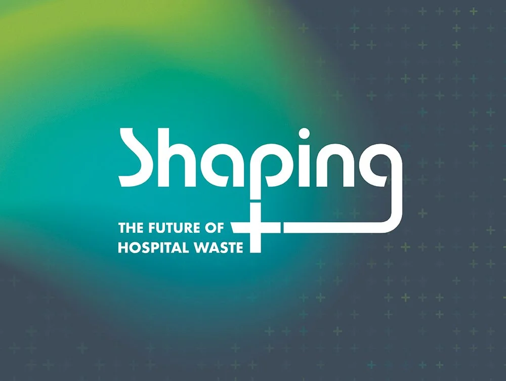
Shaping the future of hospital waste
BRAND DESIGN, CAMPAIGN DEVELOPMENT
Daniels is often perceived as a sharps company. In reality, it offers a full-suite hospital waste solution. This campaign was about correcting that perception globally.
-
![]()
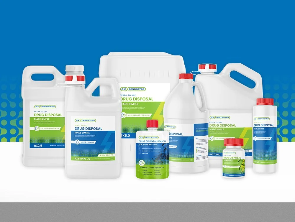
Rx Destroyer
BRAND DESIGN
Rx Destroyer had grown up. The products expanded, the distribution grew, the company was acquired, but the brand hadn’t fully caught up.
-
![]()
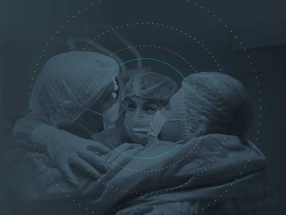
Healthcare uninterrupted
CAMPAIGN DEVELOPMENT
This campaign tackled one of the biggest barriers in healthcare: fear of change. We positioned Daniels Health as the partner who makes vendor transition seamless, not scary. -
![]()
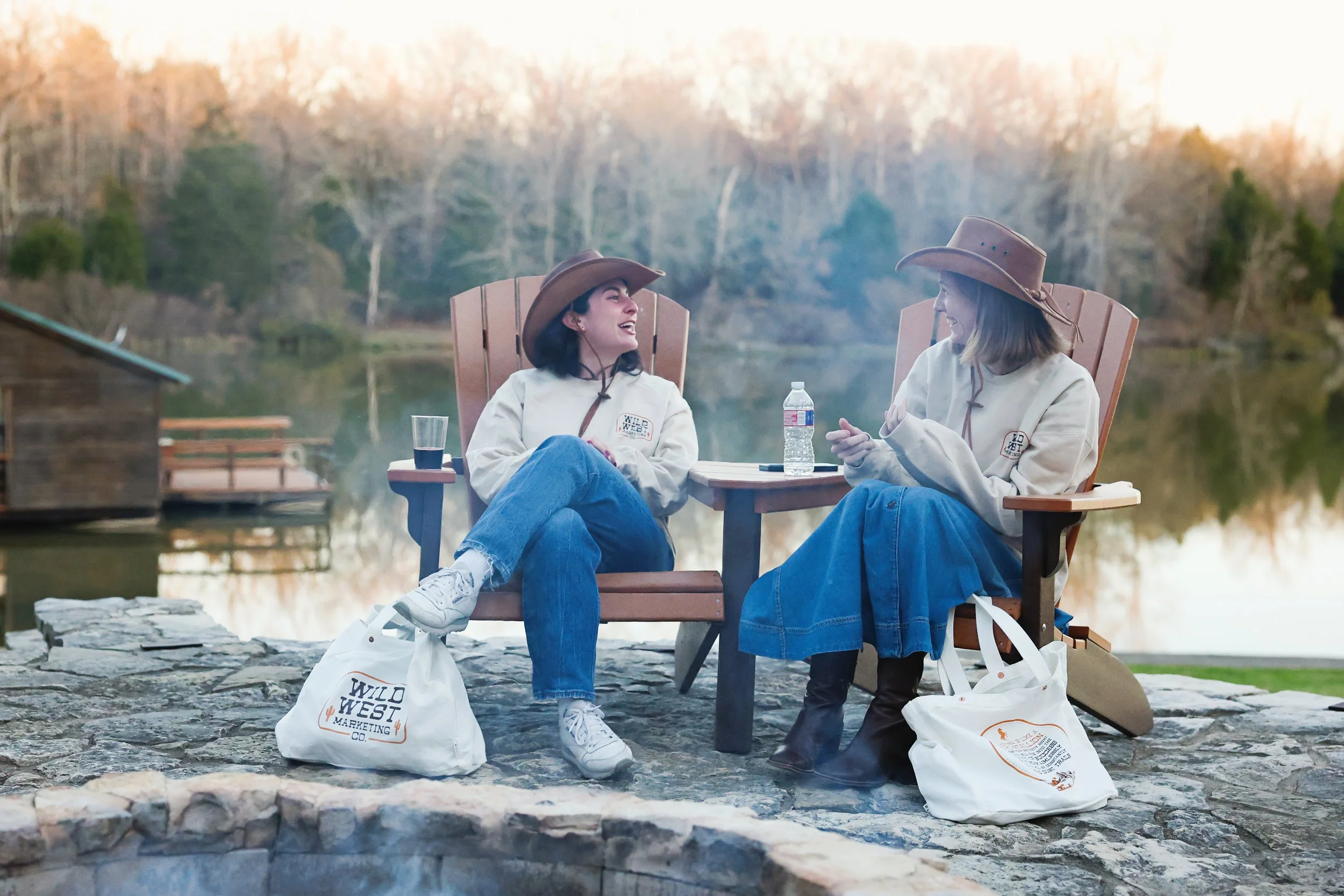
Internal summit branding
BRAND DESIGN
Over several years, I developed logo identities for internal summits and leadership events. Some required full mini brand systems. Others primarily lived on swag (which, let’s be honest, is often what people remember most).
-
![]()
Let Your data go to waste
CAMPAIGN DEVELOPMENT
This campaign promoted Daniels’ proprietary location-level data tracking with one goal: drive demo requests.